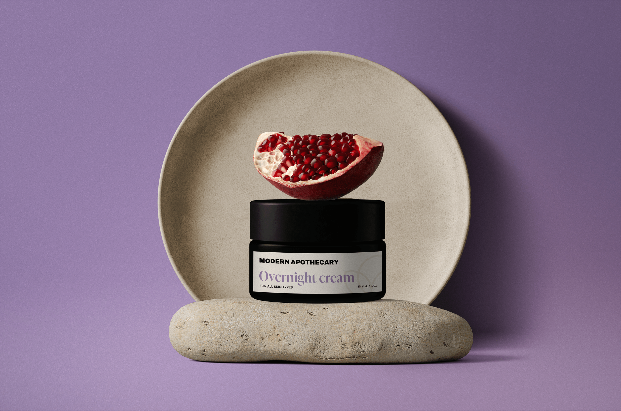
A modern approach to traditional skincare
Modern Apothecary was born from a vision of reimagining traditional apothecaries for the modern world; they combine the wisdom of natural, herbal remedies with cutting-edge science to create a range of carefully formulated skincare products. The founder approached us with the vision of elevating their packaging design to seamlessly fit into retail spaces such as Marks & Spencer's and John Lewis, and resonate with their target audience: the modern woman who values both science and nature.
Our primary goal was to create a brand identity and packaging concept that balanced the traditional with the modern, which helped inform all of our design decisions, as well as the choice of product containers. To convey a sense of science, we curated clean and minimal fonts that allow the product to be the focal point, while our choice of brown bottles with white labels pays homage to traditional apothecaries, reinterpreted with a modern twist. To bring the rest of the brand to life, we create a colour palette of deep purples and blues, further creating a balance between the aura of old-world apothecaries and modern science.
WHAT WE WORKED ON
Brand identity
Product packaging
Vessel consultancy


